Introduction
Every leveraged position in the market has a liquidation price — the level at which the exchange forcibly closes the position if it moves against the holder. These levels do not disappear from the market; they accumulate across thousands of positions and create predictable clusters of forced selling or forced buying waiting to be triggered.
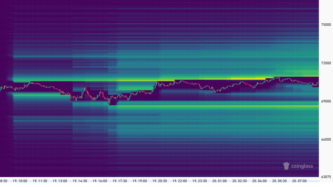
Liquidation maps, popularised by CoinGlass, visualise these clusters as a heatmap overlaid on the price chart. Dense clusters of liquidations act as price magnets — the market tends to gravitate toward them, triggering the liquidations, absorbing the forced selling or buying, and then often reversing sharply once the cluster is cleared.
This article explains how liquidation maps are constructed, how to identify the key clusters, and how to use them as part of a broader market analysis — not as a standalone signal, but as a tool for understanding where the highest-leverage pressure points in the market are located.
How Liquidation Maps Are Constructed
Liquidation maps are estimates, not exact data. Exchanges do not publish individual position liquidation levels — that information is private. CoinGlass reconstructs the probable distribution of liquidation prices using publicly available data:
- Open Interest by price level — the distribution of OI across price levels, derived from order book and position data
- Estimated leverage — the typical leverage ratios used at different market conditions, inferred from funding rates and historical patterns
- Exchange margin rules — each exchange’s maintenance margin requirements, which determine at what price a given leveraged position gets liquidated
The result is a probabilistic heatmap — brighter (yellow/white) areas indicate price levels where a large number of positions would be liquidated if price reached there. Darker areas indicate sparse liquidation clusters.
What CoinGlass shows
The heatmap displays liquidation clusters both above and below the current price:
- Clusters above current price = concentrated short positions that would be liquidated if price rises to that level (forced buying — adds upward momentum)
- Clusters below current price = concentrated long positions that would be liquidated if price falls to that level (forced selling — adds downward momentum)
Reading the Heatmap
Identifying significant clusters
Not all clusters are equal. The ones worth tracking are:
1. Dense, isolated clusters — a bright concentration at a specific price level with relatively sparse liquidations around it. These act as the clearest magnets because the market must move decisively to reach them and the impact is concentrated.
2. Stacked clusters across a range — multiple overlapping clusters between two price levels. These create a ”liquidation zone” where a move through the range triggers a cascade: each cluster liquidated adds momentum that pushes price toward the next.
3. Asymmetric distribution — when the liquidation map shows significantly more clusters on one side than the other, it reveals a positioning imbalance. Heavy long liquidation clusters below and sparse short clusters above suggests the market is more vulnerable to downside than upside.
| Cluster Type | Location | Interpretation |
|---|---|---|
| Large cluster above price | Key resistance level | Short squeeze fuel — a break above could accelerate sharply |
| Large cluster below price | Key support level | Long liquidation risk — a break below could cascade quickly |
| Clusters on both sides, evenly distributed | Above and below | Balanced — market may range until one side is cleared |
| Dominant cluster one side only | Far above or far below | Directional bias — market frequently moves to clear the dominant side |
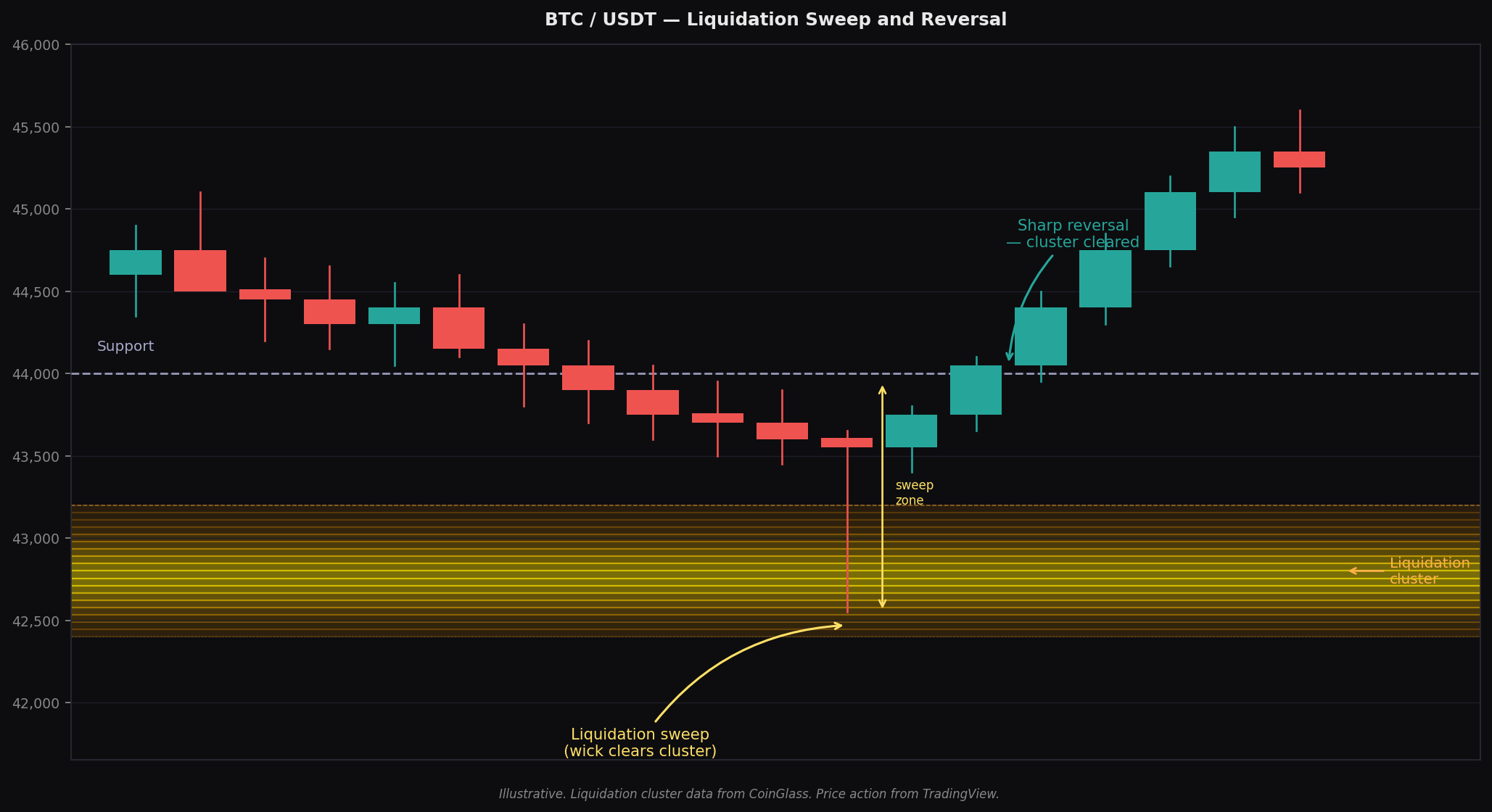
The liquidation cascade
When price reaches a liquidation cluster, what happens next follows a predictable sequence:
- Price touches the cluster level
- Forced liquidations execute — long liquidations add sell pressure, short liquidations add buy pressure
- The additional pressure from liquidations pushes price further in the same direction
- The next cluster is reached and the process repeats
- Once the clusters are cleared, the forced buying or selling exhausts itself and price often reverses
This cascade dynamic is why large moves in crypto can feel mechanical — they frequently are. The price is being pushed through a series of forced-closure events until the leverage is washed out.
Liquidation Maps vs Price Action
Liquidation maps should always be read alongside price action, not in isolation. A liquidation cluster at a given price level does not guarantee price will reach it — the map shows where the pressure points are, not when they will be triggered.
The most reliable setups occur when a liquidation cluster aligns with a technical level:
Short squeeze setup: a large short liquidation cluster sits just above a well-defined resistance level. If price breaks through resistance on volume, the liquidation cascade adds fuel to what would already be a technical breakout — the move tends to be faster and larger than it would be without the cluster.
Long liquidation sweep: a large long liquidation cluster sits just below a support level. If price loses support, the cascade effect means the move through support is swift and often overshoots before recovering.
Stop hunt and reversal: price briefly pierces a cluster, triggering the liquidations, then immediately reverses. This is the classic ”wick” pattern on a candlestick chart — the move was driven by liquidation clearing rather than genuine directional conviction, and once the clusters are swept, buyers or sellers step back in.
Limitations and Common Mistakes
Liquidation maps are estimates. The data is constructed from public information and assumptions about leverage distribution. The clusters show probable concentrations, not exact liquidation levels. Treat them as zones, not precise price targets.
Large players know about the clusters too. Market makers and well-capitalised traders are aware of visible liquidation concentrations. In some cases, price is deliberately pushed toward a cluster to trigger liquidations and absorb the forced flow at favourable prices — sometimes called ”stop hunting” or ”liquidation hunting.” This is legal in crypto markets.
Clusters shift constantly. As positions are opened and closed, the liquidation map changes. A cluster that was significant at the start of the week may have been partially absorbed or replaced by the time you are trading. Check the map close to the time you are making a decision, not in advance.
Do not trade the map alone. The most common mistake is seeing a large cluster above price and assuming price will reach it. The cluster shows where forced buying would occur if price gets there — it does not create its own catalyst. You still need trend, momentum, and market structure to be pointing in the right direction.
Practical Use in a Weekly Review
Liquidation maps are most useful as a context layer on top of your existing analysis — not as a primary framework. In a weekly review:
| Step | What to look for | How it informs your view |
|---|---|---|
| Identify the largest cluster above price | How far is it? How dense? | Sets a potential upside target if trend is bullish |
| Identify the largest cluster below price | How close? At what price level? | Identifies downside risk zone — where support may fail fast |
| Check distribution asymmetry | More clusters above or below? | Reveals which direction is more leveraged and therefore more volatile |
| Cross-reference with technical levels | Does any cluster align with support or resistance? | Highest-conviction levels — a move through these is likely amplified |
Where to Access Liquidation Maps
CoinGlass (coinglass.com) is the standard tool for liquidation heatmaps. Navigate to the Liquidation Heatmap section, select the asset (Bitcoin is the most data-rich), and choose your timeframe. The heatmap is available for multiple exchanges individually and in aggregate.
The aggregate view is more useful for macro analysis — it captures the full picture across Binance, Bybit, OKX, Hyperliquid and others. Individual exchange views are useful if you are trading on a specific venue and want to understand the local liquidation structure.
CoinGlass also provides a Liquidations dashboard showing real-time liquidation events as they occur — useful for understanding which side is being wiped out during active moves.
Key Takeaways
- Liquidation maps show estimated concentrations of leveraged positions that would be forcibly closed if price reaches a given level — these clusters act as price magnets
- Clusters above price represent short liquidations (forced buying); clusters below represent long liquidations (forced selling)
- The most powerful setups occur when a large liquidation cluster aligns with a technical support or resistance level — a break of that level triggers both technical and forced-flow momentum
- Liquidation cascades explain the mechanical quality of large crypto moves — price sweeps through a series of clusters, each adding momentum, until the leverage is cleared
- Treat liquidation clusters as zones of elevated volatility, not exact price targets — the map is probabilistic
- Always combine liquidation map analysis with trend, OI and funding data — never use it as a standalone signal